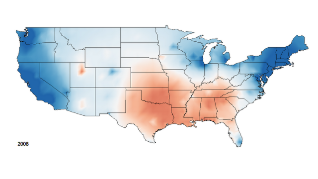
Map by David B. Sparks
Instead of a standard county-level choropleth map of election results,David B. Sparks created an isarithmic or contour map of the data. He used the centroids for each county and election results to create a surface. Essentially the height measures the strength of Republican or Democrat support. Then, he interpolated between elections to create a video of the changing results. The video is a great visualization of the process of change. A weakness is that it uses the Mercator projection And of course, another inherent limitation of this type of mapping is that there is no indication of the number of people in a given county. Still, it is a very effective map visualization. The patterns demonstrate the power of place in shaping political allegiances. Changes sweep across the landscape, distinctive cultural regions such as the Mormon heartland stand out, and urban centers are often distinct from their suburban or rural hinterlands.